Most stores still treat gifting like a hidden add-on. That creates friction at the exact moment a buyer wants convenience. The fix is not complicated, but it needs to be deliberate.
This is the high-level UX playbook. For implementation details and edge-case QA, see Shopify gift message UX.
Why It Breaks
Gifting breaks when it feels like extra work. Buyers should not have to hunt for the option or re-enter the same information multiple times. If the flow adds steps without adding clarity, conversion drops.
Common failure modes:
- Gifting is only exposed at checkout (too late).
- Gift notes live on a separate page (feels like a detour).
- Mobile UX stacks modals and keyboards (death by friction).
- Multiship feels fragile (buyers fear mistakes).
- Confirmation screens do not show "who gets what" clearly.
Core Patterns
CTA
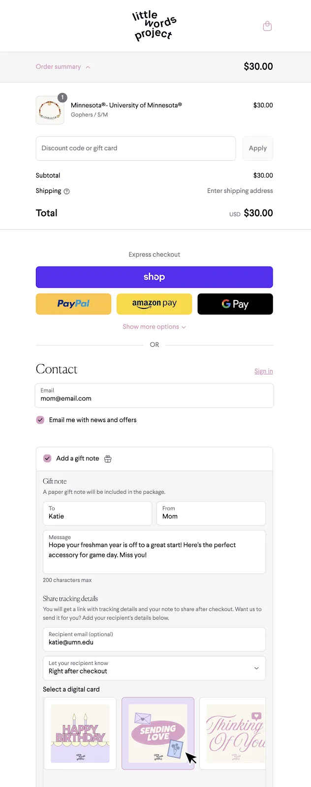
Use a clear "Send as a gift" callout on PDP and cart. Make it visible but not intrusive. When buyers know gifting is supported, they self-select into the flow early.
Occasion
Prompt for an occasion and offer a delivery date picker. This reduces decision anxiety and increases basket size. It also makes it easy to send the gift at the right time. If you want a deeper strategy lens, see Right-Time Marketing.
Notes
Gift notes should be inline, not a separate page. Keep fields short, provide character limits, and show a live preview.
The goal is confidence: buyers should see what will print, and know it will look good.
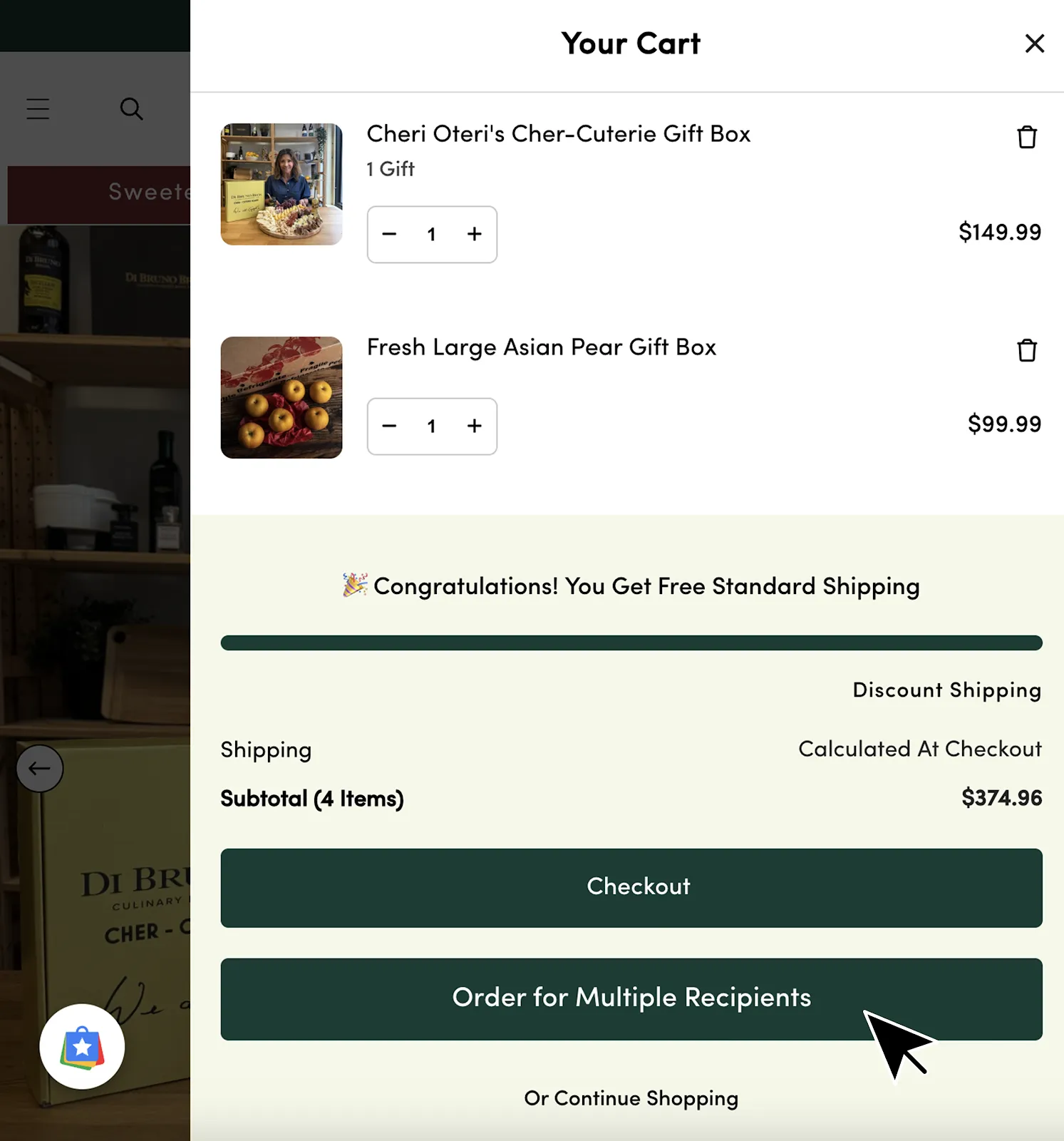
Multiship
Multi-recipient checkout is the fastest way to unlock gifting scale. It saves buyers from repeating checkout and removes a major source of abandonment.
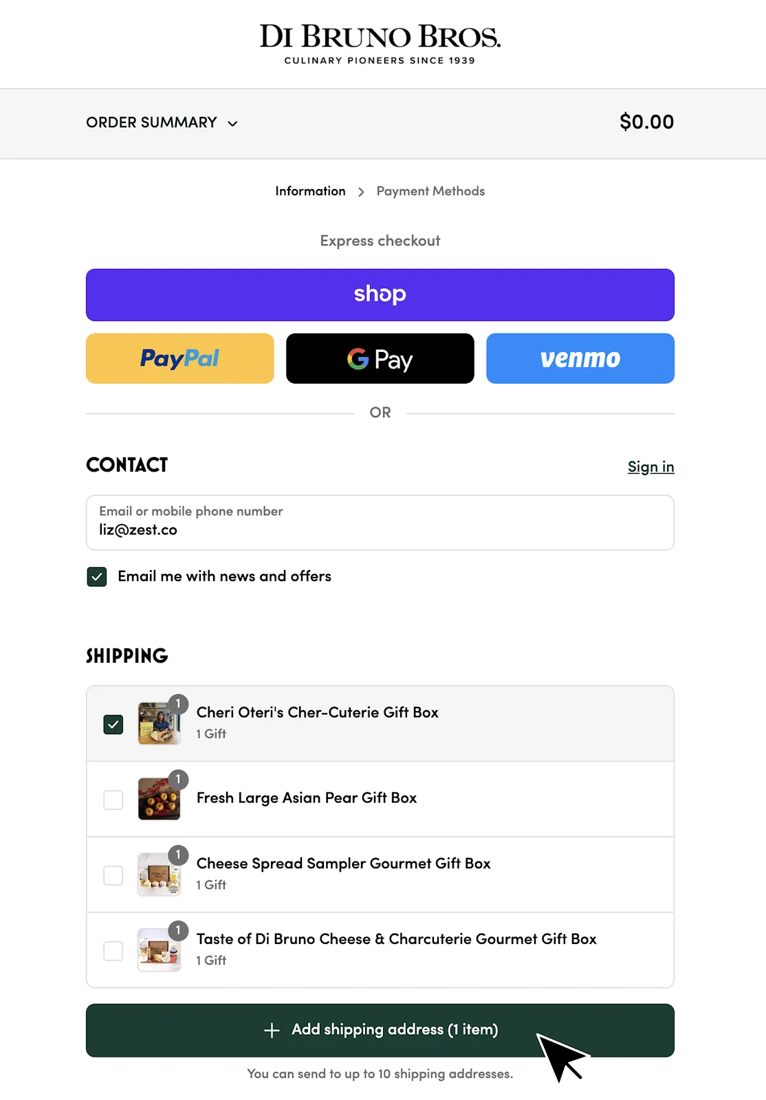
The key is giving buyers clear feedback on who gets what, and making address assignment feel fast rather than fragile. A good multiship flow should feel like editing a shared cart, not filling out multiple forms.
Multiship UX requirements:
- Show a per-recipient summary ("items, address, delivery date, gift note").
- Make edits safe (change address or note without losing assignments).
- Validate early (bad addresses should fail before payment).
- Make bulk actions obvious (duplicate recipient, copy note, import CSV).
- Put cutoffs and delivery expectations next to the date picker.
Mobile-First
Mobile is where most gifting discovery happens. Keep the gifting CTA above the fold, avoid modal stacks, and make validation feel supportive (not punitive).
Quick checks:
- Keyboard does not cover the primary CTA.
- Errors are specific ("message too long" not "invalid").
- Date pickers work reliably across devices.
- Confirmation screens are readable and scannable.
What to Test
Start with a few simple experiments.
- PDP CTA placement and copy.
- Gift note field count and placement.
- Occasion prompts vs no prompts.
- Multiship entry point in cart vs checkout.
Measure more than conversion rate. Track gift adoption, time to complete checkout, and support contacts for gifting-related issues.
Next Steps
Once the front end converts, make sure the unboxing and recipient flows are ready to capture the second customer. If you are planning for peak, see Getting Gifting Ready for Q4.
For what to do after delivery, see Unboxing ROI and Turning Gift Recipients into Repeat Customers.